

To use or not to use COLOR in your home!
When decorating your home should you use bold, beautiful colors or keep it neutral?
Today, we’re going to dive into a colorful topic that has been a subject of debate in the world of interior design: the use of color versus the absence of color. Whether you’re a vibrant soul or a lover of minimalist aesthetics, the choice of using color or not can have a significant impact on the ambiance of your home. So, let’s explore the differences and embrace the beauty of both approaches!
Using Color: A Kaleidoscope of Personality
If you’re someone who thrives on vibrant energy and loves a playful, fun atmosphere, incorporating color into your home is like adding a dash of magic. Colors have the power to evoke emotions, set moods, and express your personality like no other element in design. When you introduce a rich palette of hues, you can transform a dull space into a kaleidoscope of happiness.
Picture this: walking into a room painted in a vibrant shade of turquoise, reminiscent of a tropical paradise. The room instantly feels alive and full of energy. Or how about a living area with a daring mix of bold reds, yellows, and oranges? It’s like stepping into a fiesta where laughter and joy are always on the menu.
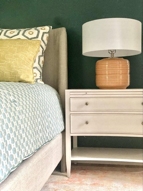
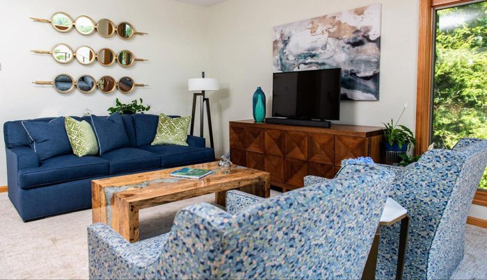
Colorful interiors allow you to create focal points, highlight architectural features, and play with contrasts. It’s an opportunity to showcase your favorite artwork, display collections, and let your creative spirit soar. Plus, let’s not forget about the delightful impact that colorful accessories, such as pillows, rugs, and draperies, can have on a space. They’re like little pops of happiness sprinkled throughout your home.
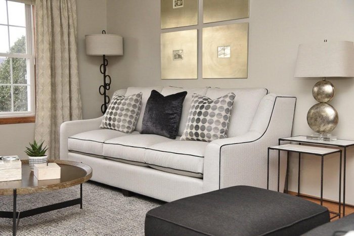
Not Using Color: Serenity in Simplicity
Now, let’s shift gears and explore the tranquil world of minimalism. If you find solace in clean lines, simplicity, and a calm environment, a neutral or monochromatic approach might be your cup of tea. Think of a pristine white room with minimal furniture and natural textures, or the black living room in our last blog. It exudes a sense of peace and serenity that’s hard to replicate.
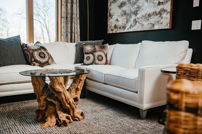
A colorless palette can create a soothing ambiance, allowing your mind to unwind and relax. It promotes a clutter-free environment and draws attention to the forms and textures of the objects within the space. By using different shades of whites or beiges, you can play with light and shadows to create depth and visual interest.
The absence of color also has a way of making a room feel more spacious and airy. It can be an excellent strategy for smaller spaces or areas that lack natural light. By focusing on simplicity and utilizing neutral tones, you can achieve a timeless elegance that transcends trends.
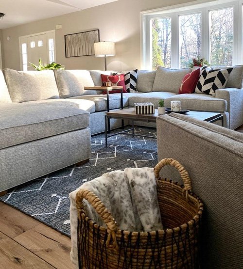
Finding Harmony: The Best of Both Worlds
Now, here’s the fun part: you don’t have to choose between color and a colorless approach. The beauty of design is that you can blend these two worlds to create a harmonious balance that suits YOU. A predominantly neutral space can benefit from pops of color strategically placed to add visual interest and personality. Conversely, a vibrant room can find balance by incorporating elements of simplicity and editing.
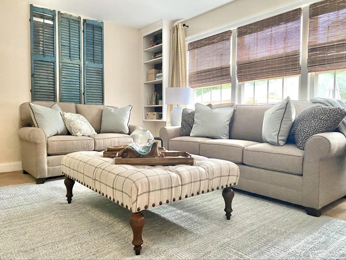
Consider using colorful accents against a neutral backdrop, such as vibrant throw pillows on a minimalist sofa or a bold piece of art in an otherwise monochromatic room. This allows you to enjoy the best of both worlds without overwhelming the senses or sacrificing your design preferences.
In the end, whether you opt for an explosion of colors or a subdued palette, the key is to create a space that reflects your individuality and makes you feel at home. Your surroundings should make you smile, bring you comfort, and inspire you every day.
So, my fellow design aficionados, let your creativity shine and embrace the power of color or the tranquility of simplicity. There are no right or wrong choices when it comes to personal expression in design. The most important thing is to have fun, experiment, and create a space that feels like a true reflection of you.
Until next time, keep dreaming in color or finding beauty in the art of simplicity. Happy designing!
Please PIN this blog to your Pinterest!