

The New Design Trend for 2021
How to Use Color in Your Home
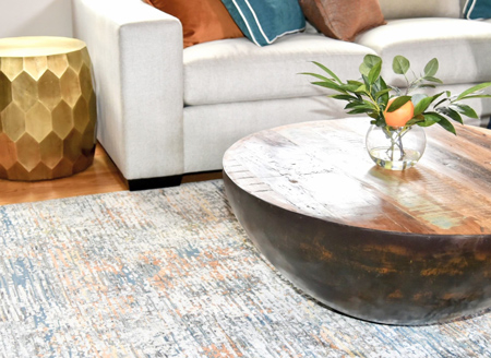
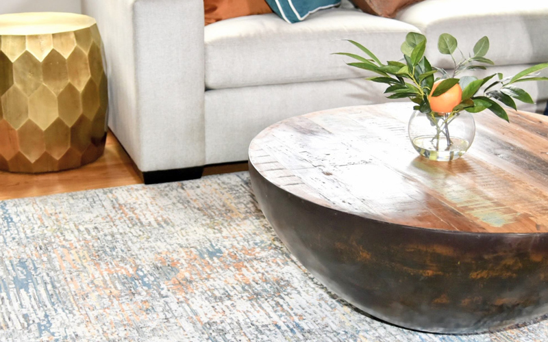
A new year means a brand new start! How about a new look for your home for the new year? There’s an interior design trend that we’ve been noticing here in Western Massachusetts that we’re hoping continues for a long time! COLOR! We seem to be moving away from the neutral gray, taupe and beige rooms and moving toward including brighter, more saturated colors. We’re all for this trend! Are you? But how do you add color to your home and still keep it classy? How do you incorporate color in your home and make it all flow? How do you elevate your home with color? How do you create a colorful home that’s not over the top?
If you’re hesitant, there are ways to bring in color without going overboard. Start with the timeless design rule – the 60-30-10 rule. That will give you some balance. Start with 60% of one color, your base, probably your walls, maybe your floors or rug too. Then add 30% of a secondary color, half the amount of the first color. This can be your draperies or your accent furniture. It’s a support color to the first one. Lastly you have 10% of another color. This will be your smaller items like throw pillows and/or accessories. We like to pull this color from fabric or artwork in the room. Sticking to these amounts is a great way to dip your toe into the world of color.
It’s true, using bold color in your home has to be done right, sprinkled in appropriately, like the 60-30-10 rule. You also need to use the right tone. You also want it to be consistent through your home. We’re here to show you how to do it! We’ve put together five color schemes to inspire you!
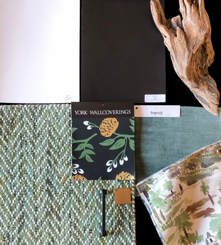
Monochromatic
If you still prefer a neutral wall color (click here for our 10 foolproof paint colors), try to bring in some color on your furniture, draperies and accessories. Tie everything in by mixing solid furniture, patterned draperies, smaller patterned chairs and a textured rug. We always recommend a timeless color/patterned sofa for longevity, but you can add color and pattern on your pillows and throws. And then add a colorful chair, area rug, draperies etc. If you’re pushing the boundaries a bit, go for a bold black accent wall! With this green scheme, it would really make the colors pop.
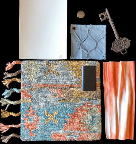
Bright & Bold
This fun scheme brings in a bright color that’s underused! Orange! If it’s used right, it can really brighten a room without being overpowering. This combo would be perfect in a family room, dining room or even a bedroom! We love orange mixed with its complementary color, blue. Be sure to add some neutrals in to ground everything. This scheme has a neutral wall color, a bright patterned rug, patterned draperies with the same orange as in the rug, and solid blue textured bedding. We paired this combo with a dark wood to bring out the deep brown color that runs through the area rug.
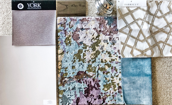
Watercolor
This bright, yet relaxing pattern and color combination will add pops of color while still feeling inviting and serene. Notice that all of the colors are the same tone. They blend well and everything is brought together by the area rug. The materials also have a little sheen and softness to them, which is perfect for cozying up. Get our tips on how to make your home more luxurious. Use this scheme in a living room or bedroom for a place to retreat after a long day. Both purple and blue are known to be calming colors, perfect for your relaxing space.
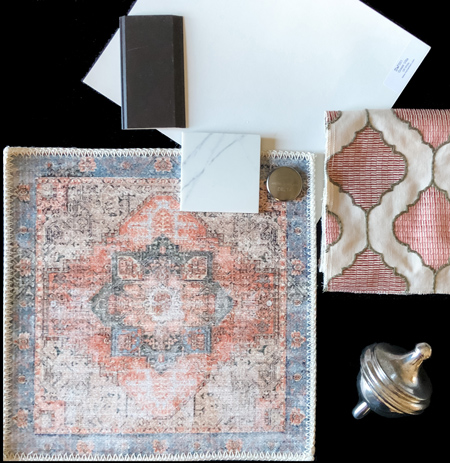
Classic
If you’re looking for a statement and you happen to be a bit of a traditionalist, go with classic red and blue! Some red and white print draperies will stand out against neutral walls. Again, notice that the colors are all the same tone. They’re somewhat muted and not in-your-face. They almost have an antique feel to them which adds to the traditional vibe. This scheme would be great in any room, but we paired it with a classic white marble-look countertop and deep brown cabinets for a rich feel. It would be the perfect eat-in kitchen! Did you know that red can improve your appetite? It’s true!
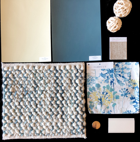
Fun Traditional
This chunky wool blue and white rug paired with a fun blue and yellow floral will light up any space! Blue and yellow are a classic combination, mixing warm and cool. It’s a fresh and fun palette. This would work in any area of your home. Family room, dining room, or bedroom, these colors will put a smile on your face.
When you look at these palettes, you can see that although they all include various colors, each group contains colors that are in the same tone. The colors have the same intensity. When you’re starting with color, keeping the same tone throughout will help it flow through your home. You’ll also see that they all include some black or white too. Adding black and/or white to your color color scheme keeps it from being too much and elevates the design.
Those are our top picks to try in the new year! Where will you add color to your home this year?
Pin this post to come back to it later!